

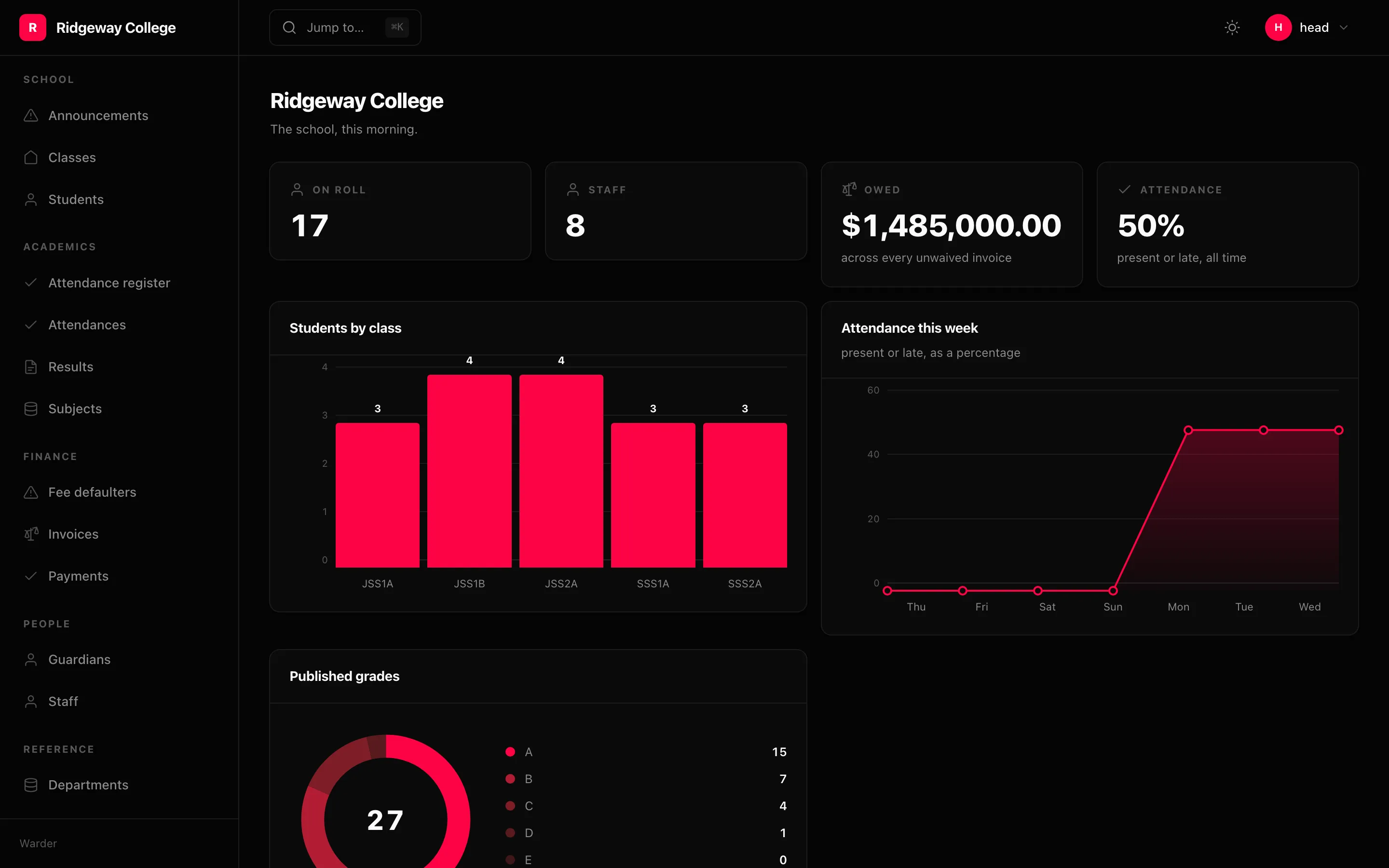
admin.add( Dashboard( Card.number("On roll", lambda ctx: Student.filter(status="enrolled").count()), Card.number("Owed", owed, currency="USD", description="across every invoice"), Card.number("Attendance", rate, suffix="%"), Card.chart("Students by class", by_class, kind="bar"), Card.chart("Attendance this week", trend, kind="area"), Card.chart("Published grades", by_grade, kind="donut", span=2), Card.table("Newest admissions", List(Column("first_name")), newest, link="/admin/student"), title="Ridgeway College", columns=4, ))Without a dashboard the front page lists the resources — a reasonable thing for it to be and a poor thing for it to stay, because the first screen is the one everybody opens first.
A loader returns data
Section titled “A loader returns data”async def owed(ctx): invoices = await Invoice.filter(waived=False) return {"value": float(sum(row.balance for row in invoices if row.balance > 0))}lambda ctx: Post.all().count() works too. A card’s loader returns data, so an
awaitable query is run rather than serialised — which is the opposite of the rule
for a Scope, whose job is to return a queryset.
Warder keeps the two apart deliberately.
Number cards
Section titled “Number cards”Card.number("Revenue", load, currency="USD", compare="30d", goal=10_000)Card.number("Attendance", load, suffix="%")compare names a period and the loader is called a second time for it, so the
card can show a delta. Without one there is no second call and no delta, because
a number with a made-up trend beside it is worse than a number.
Return a bare value, or {"value": …, "delta": …}.
Charts
Section titled “Charts”Four kinds, one data shape — [{"label": …, "value": …}]:
Card.chart("By status", by_status, kind="bar") # bar, line, area, donutPython counts the rows; the browser decides how tall a bar is on this screen. Axes pick a round step (1 / 2 / 5 / 10 × 10ⁿ) so the labels are whole numbers rather than “3.8, 2.5, 1.3” above a column of whole students. Values are drawn above the bars, because a number you have to hover to read is a number nobody reads — and hovering does not exist on a phone.
A donut’s slices are derived from the accent with color-mix, so six categories
need no palette and follow the theme.
Table cards
Section titled “Table cards”Card.table("Latest orders", ORDERS, load, link="/admin/order")Reusing a List you already have is the point: the dashboard’s “latest orders”
and the orders screen format money and status the same way because they are the
same value.
Span and gates
Section titled “Span and gates”Card.chart("Revenue", load, span=2)Card.number("Payroll", load, gate=Gate.permission("finance.view"))A card whose gate refuses is absent, not greyed out.